

Pretzel Kids
Desktop website for users to connect with smaller businesses and bring yoga to kids

Overview
Pretzel Kids is a desktop platform designed to offer mothers, fitness enthusiasts, and educators all-in-one yoga training and curriculum. Pretzel Kids empowers children to exercise healthy mental and physical activities for the development of their mind. View prototype here
Problem
Pretzel Kids B2B/B2C was launched in 2017; however, the client specifically requested a redesign of the home page, focusing on incorporating new features. These features include advance functionalities such as scheduling, how to apply for training, and how to hire a yoga instructor for the school. There was a lack of fluidity when applying for training user flow, resulting in an unintuitive experience for the user.
Solution
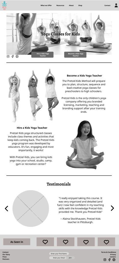
Establishing a Straightforward Process for Users
Developed a streamlined and user-friendly process to cater to the diverse needs of our users. The platform offers an intuitive application system for training, simplified scheduling procedures, and access to comprehensive information about schools for teaching. Additionally, incorporated a robust filtering mechanism to enhance the user experience.Application for Training
Established application process provides users with a straightforward method to apply for various training programs. The system prompts users to input their relevant information, educational background, and preferences, ensuring a tailored experience from the start.Simplified Scheduling
Integrated an efficient scheduling feature that enables users to manage their training schedules with ease. Whether it's selecting preferred timing, rescheduling sessions, or viewing upcoming events, our platform ensures a hassle-free scheduling experience.Access to School Information
Users can now conveniently access detailed information about schools for teaching, including location, facilities, faculty, and curriculum. This facilitates informed decision-making and empowers users to explore opportunities that align with their goals and preferences.Enhanced Filtering Options
Enhanced filtering system, allowing users to refine their search based on specific criteria such as location, training program types, and schedule availability. This functionality optimizes the search process, saving users valuable time and effort.
This comprehensive approach reflects the commitment to providing an optimal experience for users navigating our platform. By establishing a straightforward process for applying to training, scheduling, exploring teaching opportunities, and employing smart filtering, I empower users to make informed decisions and pursue their educational and professional aspirations effortlessly.
Tools
Figma, Google Forms, Maze
Timeline
Discovery, Ideation, Design, Usability Testing, Developer Handoff
Role
UI/UX Designer
UX Researcher

Discovery
In the initial phase of the project, the client presented the project concept, priorities, competitors, key user demographics, and user stories. The main objective at this stage was to develop user flows, wireframes, high-fidelity mockups, a style guide, and a developer handoff.
After the discussion with the client, here are some key takeaways:
Main Competitors
Yoga Kids, Kidding Around Yoga, Cosmic Kids, and Yoga Ed.
Liked/Disliked Features from Competitors
Pros: Particularly liked Yoga Ed’s visually simple UI website
Cons: Cognitive overload right at the home page, not an easy checkout process when searching for training/certification
User Requested Features
Feature 1 Prioritize to Specific Target Audience: Users need to be aware that the site only offers training/certification and a station to hire a yoga instructor to teach at their event/school. The solution involves redesigning the CTA buttons to lead to the pages to make it intuitive, allowing users to jump in and schedule an instructor and/or book for training.
Feature 2 Improve Checkout Process: Users are going through loopholes before checking out for training, causing users to leave the site. A moderator tool is needed to guide users to click at the right cta (call-to-action button) so that they can complete their checkout process.
Feature 3 Consistent and Clean Design: The website lacks consistency, utilizing the Material Design UI library along with custom elements. The solution involves a redesign to ensure consistency and cleanliness.
User Feedback
Users enjoyed using the curriculum for teaching and training for certifications, leading to high retention and virality. However, there is still room for improvement.
Based on these insights, the proposed solution focuses on addressing the identified user features, improving the website's design consistency, and enhancing the overall user experience.
Information Architecture/Site Mapping
Before I began design sketches, mapping helps understand the original user flow of how a user might go from one page to the next.
Through the mapping of the original website, we could see that users are asked for the same cta button among many pages with similar content. Which can increase fatigue and produce users to click out than stay on the page.

User Testing Feedback
Ideation
A consistent observation from our user interviews and survey data, most participants expressed frustration over how difficult it was to navigate on the website — specifically how to find available classes, where to sign up, and what does Pretzel Kids offer that is different from their competitors. This was a major factor that led to high attrition/drop-off rates.

User Flows
Before I began design sketches, mapping helps understand the original user flow of how a user might go from one page to the next.
Through the mapping of the original website, we could see that users are asked for the same cta button among many pages with similar content. Which can increase fatigue and produce users to click out than stay on the page.


Wireframes
Using the established design components and style guide, I translated the user flows into visual representations. My main focus was on designing the become a yoga instructor and hire a yoga instructor flow. This included creating a clear overview for users to schedule/book. Additionally, I incorporated design styles and features inspired by one of the competitors, such as prominently minimizing the navigation bar and page content. Throughout this process, I paid close attention to hierarchy and visual organization to ensure a smooth user experience.
These wireframes played a vital role as communication tools, enabling stakeholders, and the development team to visualize the structure the flow of the product.


Design
Style Guide
Things that worked:
5 out of 5 users appreciated the layout consistency and direct CTA buttons that led to easy navigation across the website.
4 out of 5 users liked the font, as it presented professionalism and readability.
5 out of 5 users found that the boxes of information was helpful in understanding what Pretzel Kids offered in terms of how to become a yoga teacher and how to hire a yoga teacher.
The Average Task Completion Rate was 90%; majority of users were able to complete the required tasks within 5 minutes.
Still needed attention:
3 out of 5 users found the pictures to be too big compared to the text: picture and typography hierarchy.
3 out of 5 users expressed that they would’ve liked some sort of incentive from being on Pretzel Kids.
4 out of 5 users understood that Pretzel Kids is a yoga-centered activity for kids but there was no enough evidence as to how this business is run and the importance of yoga for kids.
3 out of 5 users expressed that they would’ve liked if the prices for training to be displayed earlier on or in the “Become a Pretzel Kids Yoga Teacher” page.
Mid-Fidelity Prototype
View the clickable prototype below:
When we showed the visual mockups, mid-fidelity prototype, and synthesized data from user interviews, here is what our client had to say:
Pros:
Liked the 2 CTA buttons made at the top of the home page over the hero image.
Agreed with the current usability feedback that the current site fonts were ineligible and unprofessional.
Liked the UX Writing we incorporated.
Cons:
Did not like how there was too much white space going on.
Wanted the original carousel to be part of every page on the bottom.
Did not like the new navigation bar content.
Style Guide
Initially, the client requested for UI Design changes. We kept the color palette consistent to the original colors on the current site but made a few changes in our typography and weights from our mid-fidelity to our high-fidelity.
Mid-Fidelity Style Guide

Hi-Fidelity Style Guide

Feature Prioritization

Next Steps:
Reflections:
(01) Build a responsive design for mobile. Pretzel Kids emphasized that their next goal after redesigning the website was to make it accessible for mobile users.
(02) Create an incentive for when first-timers users on the site. That way, it will help encourage users to come back on the site. The current free guide it offers isn’t free at all. Oftentimes, first-time users like freebies and a first-time discount on a site to keep them coming back.
(03) Conduct A/B testing on how to make the website more convenient and efficient for users. In the second round of usability testing, users were able to complete everything within 5 minutes. I would like to see what features and design iterations needs to be changed for users accessibly navigate through the website.
Users need a visual guidance to follow in order to complete their tasks, but when presented with too many options they can get confused and overwhelmed.
As the only UX Designer on the team, there was a lot of research that had to be done to tailor the design feedbacks for this website. Pretzel Kids wanted to only make minor changes to what she thought was good for her redesigned website but when we showed her the research, she was still adamant about wanting things her way. At the end of the day, I learned to rationalize in limited design spaces. Less is more but make it visible, direct, and concise.